What is the easiest way to persuade another person? Yes, you are absolutely right: you should have a convincing and persistent tongue, use numbers, promises and guarantees. But is it possible to achieve the same result without words? It seems incredible, but successful web design can actually convince even better than the flow of text.
Make it clear!
When a visitor comes to your landing page, he needs to answer for certain questions, and he wants to get them quickly and easily. Thus, the first words read by the visitor on the landing page must answer three questions:
• What service is offered on this web site?
• What can I do here? / Is this what I'm looking for?
• Why should I order (purchase) here? / Why is this website beneficial for me?
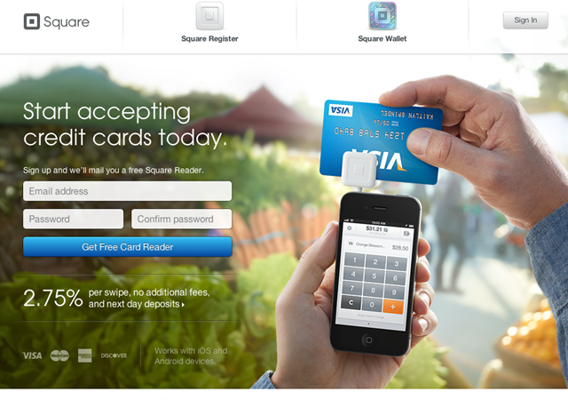
Let’s see an example
This website answers every question.
• What service is offered on this web site? – “I will have an opportunity to accept credit cards today”. We have a clear answer and relevant illustration of the meaning.
• What can I do here? - “I can get a card reader for credit cards”.
• Why should I order (purchase) here? – “It's free, and here I they offer the lowest transaction fees - 2.75%”.
In other words, learn to emphasize the uniqueness of your offer. Your proposition should answer the main question implied by the visitor: "Why should I buy from you instead of your competitors?".
Visual attractiveness
Once people realize that they have found the “right” website, and that your offer is beneficial for them, you have to lead them through the whole process of purchasing.
The user needs approximately 50 milliseconds to form an opinion about your landing page. Depending on this opinion the user will decide to stay or leave the website.
Which design can be considered as attractive to the customer? Fortunately Google has conducted a survey and determined 2 main factors which can guarantee high level of attractiveness for the average user :
-
low visual complexity ( the simpler is the better);
-
compliance with stereotypes ( design must conform to the understanding of how the website should look like) .
Make your web design simple and recognizable (it should meet the generally accepted ideas). If you are developing an innovative, unconventional layout, you are less likely to please people.
Strict visual hierarchy
Visual hierarchy is one of the most important principles successful web design . Visual hierarchy implies the order in which the human eye grabs information.
Some parts of the site are more important than others (forms, calls to action, title, etc.) and you want them to get more user’s attention. In case the site menu has 10 items, consider whether all of them are equally important. If you want the user click on a particular menu item, make important links and buttons more visible with the help of bigger size or colors.
Remember that empty space on the website emphasizes the importance a certain element surrounded by this emptiness.
Holding attention
In most cases, the most eye-catching area on the web page is left upper part of the screen (for 69% of users). Thus, it is highly advised to place important information there. Another wonderful approach is to use photographs of people looking directly at the audience. During the conversation we usually look into each other's eyes, so such photos are like a magnet for visitors. Try to use such approach as contrast expressed in the phrase "Before and After" and "Then and Now".
Not only pictures, but also unusual phrases can attract attention. Unexpected text will definitely make your visitor to read the promotional offer. This is a good example of such offer.
The above principles do not limit your creative work, but only help you to influence the target audience, using techniques of persuasive web design.
About the author: Melisa Marzett is a talented writer who works in such fields as web design, marketing and promotion. It is easy to talk with Melisa on Google+.


"Be the first to express your thoughts"
Post a Comment
Important - Make sure to click the "Subscribe By Email" link below the comment for to be notified of follow up comments and replies.If you use Name/URL don't use keywords as your name. We love to hear from you! Leave us a comment.
To ensure proper display, HTML/XML/JavaScript need to be Encode first using this Encoder Tool Then paste the Encoded code here.