Menu Close Menu

0 comments

Hows Social Media Becomes Most PopularGuest Post - Our host is Eric Santos, (Has explained Social Popularity.)The spawning of internet has led to the explosion of social media because many people are joining it in hordes. With over a billion members, sites such as face book have become overcrowded. Many companies are jostling for marketing space in the online sphere and the techniques of attracting the users are becoming stale. The Saturation of the market calls for innovative methods which could attract traffic to the website. Recent Market research has shown that the fan base of major companies on social media is dwindling. Many corporations are trying to devise new strategies for retaining the users and adding new ones.

 
In past people used the advertising platform as a means to enhance the customer base because it ensured round the clock presence. The medium is losing its sheen because people are indifferent towards the advertisement appearing in the sponsored section. Companies are making it more complex; however it does not have any results. Therefore, they are focusing on enhancing the ranking of the website in the organic search engine listings.


Initially an explosive growth of the social media buoyed the people to extend the number of followers; nevertheless it has only become a numbers game because many people are not even bothered about the regular updates. Apps like DWIBBLES ( dwibbles ), Prismatic (getprismatic) could become solution for the users because it is tailor made for them by customizing the updates that users actually want to see. Undesired updates are rejected by the application because they are too many and tend to clutter the mindset. Apps like DWIBBLES are  responsible for bringing in new and relevant feeds to the users. 


The ticker and the graph are introduced by the face book to ensure that organic sharing is accomplished without pushing a button. Using a third party application, one can limit the number of updates to a great extent. To enhance the customer base, one has to be innovative and make the people interactive on the status updates. Although, a community might have many members but all of them are not interested in the products or services unless they are cajoled into.


The solution is not to acquire the different platforms but deploy novel ideas to attract the number of followers. They should be responsive unlike the present scenarios where their interaction is limited to only the likes on the updates.  Photo sharing is one of the best methods to inculcate interest among the users so that they could participate in discussion.


Read Article →

2 comments
SEO Mobile Tips
2013 has been named the Year of Mobile Commerce; with the Google searches from mobile devices expected to surpass the searches made by desktop computers each day during this year. With the number of smart phones and tablets in use expanding exponentially, now has never been a better time for companies to embrace mobile websites. Remember, your competitor is now only ever a click away. A poor mobile user experience could see shoppers and clients turn to those who make it easier for them.

When approaching a mobile website


It is vital to remember that mobile visitors are interacting with your website in a completely different way to the desktop user. Use Google Webmaster tools to understand your analytics and segment out current mobile traffic to get a better understanding of how existing mobile users wish to use your website from their devices. This will also help you understand your organic keyword traffic. Although your desktop website rankings can help with mobile SEO, you may find that the keywords used for your desktop site are not relevant to your mobile. This is why re-optimization is advised.

When you understand the end-user’s goals


Designing a mobile website is straightforward. If you discover that mobile users are seeking store locations or contact details whilst using their mobile devices, you can make sure these are a prominent feature of your mobile homepage. Mobile sites will load more slowly than desktop pages, so keep your design streamline and low-fuss in order to enhance the user experience. You will need to consider the navigation of your mobile site too, mobile users tend to hate having to scroll.

Did you know that 40% of mobile search is local?


This means it’s important to consider local search and geo-positioning when undertaking your mobile strategy. The use of HTML Geolocation API is advantageous.

In terms of SEO link building,


Fortunately there is no need to build separate links to your mobile site. Google knows that both sites are the same, despite the difference in content and layout. Today mobile web users expect that your website is responsive, which means the site will automatically convert to a mobile design when being reached on a mobile device. This saves the user hassle and time of having to select a mobile web option or entering a separate domain name. Normally mobile browsers emulates a desktop view by squeezing big resolutions into small screens that is often difficult to read and browse. You must be familiar that how difficult it is to click a web link in IPHONE unless you zoom it.. In order to tell the browser to detect the screen size we will add a META viewport tag inside <head> section of your layout.
Any Template can be converted into a flexible layout in just two simple steps:

1. Add Meta Viewport


Paste Following Code just below <head> tag.
“width=device-width” detect the screen size.
<meta name="viewport" content="width=device-width, initial-scale=1, 
maximum-scale=1">

2. Use CSS3 Media Queries


See these two media queries for smart phone and Tablet devices.
@media screen and (max-width : 480px) {
/* If screen size less than 480px Load this style */
/* Done for Smart Phone */

}

@media screen and (max-width : 768px) {
/* If screen size less than 768px Load this style */
/* Done for Tablet */

}

The use of a sitemap is also important to mobile SEO


You may already have a mobile HTML sitemap in place, but it is best practice to add an XML sitemap to your mobile website and submit this to Bing and Google. This will allow search engines to make a note of your separate mobile website. An effective mobile website is extremely easy to achieve, but alongside SEO techniques for mobile optimization, it is important to keep the end user in mind. This way you will get more traffic and help boost your rankings further. Another tip to remember is that as mobile screens are smaller, it’s important to keep Meta descriptions and tags to a mobile-friendly style too: 40-60 characters for tags and 90 characters for descriptions.

Read Article →

2 comments

Your Website Can Benefit From Facebook Guest Post - Our host is Miranda C,  has explained some well tips for 5 Ways Your Website Can Benefit From Facebook  . Become a guest author on Blogger Tricks. Have you just recently started a website? Or perhaps you’ve had a website up and running for many years.  Either way, Facebook is something you may want to look into if you’d like to improve your website overall.  As many of us know Facebook is one of the most popular social media websites out there in these days.  Not to mention, it’s popular for a reason. So, how can your website benefit from Facebook?  Continue reading below to find out.


Fan Base


Would you like to create a huge fan base for your website?  Well, now you can.  With Facebook, all it takes is just one second to “like” a page and to become a fan.  When people become a fan of your website, they will get every update you post to Facebook.  For example, if you’d like to promote or update something, stream it through Facebook and the updates will be automatically displayed on the person’s Facebook.  This is very easy and can have huge potential!  Not to mention, if your fans “like” your page, there may be a good chance that word will spread and more and more people will be drawn to your website.


Up To Date


Because technology is always changing, you want to make sure you keep yourself up to date.  By having a Facebook account for your website, you will appear more up to date to your fans.  No one wants to visit a website that seems outdated and unreliable.


Legit


When you take the time to do things such as create a Facebook account for your website, it makes your website appear more legit.  Websites that look like work has been put into them seem more credible and reliable.  By creating an account on Facebook, you may be one step ahead of your competitor.


Send traffic


If you would like to see an increase in your traffic, then be sure to create an account on Facebook.  As mentioned earlier, when you update your website, your fans or people that “like” your page will get your updates on their page automatically.  What does this mean?  Constant reminders of your website and hopefully more traffic and hits to your website.


Updates


If you have an important message to send to your fans, or you’d like to share something as simple as an article you’ve written for your website, it has never been easier.  You can set up your Facebook account to update every time you update your website.  This makes life easier and keeps your website fresh.
As you can see, there are some great ways your website can benefit from Facebook.  Although it may be some work to get started, everything after that is a piece of cake.  So, what are you waiting for?  Why not start getting more traffic, and make your website look even more up to date with technology?


Read Article →

3 comments

Social Subscription Box Have you ever thought of combining all Social Subscription Buttons into one Cute little Widget? The main idea behind adding all the Social Buttons into one widget is to give multiple options to the users so, they can subscribe to your site with their personal favorite social platform. The Idea of joining Social Buttons into one gadget is not different because there are lots of Subscriptions widgets that work in the same fashion. However, they are not flexible enough to support all foremost Social Platforms. For that reason, we have designed a brilliant Social Subscription widget. It has all the key Social Platforms that are essential for a website. Today, in this article, we will Learn How to Add Advance Social Subscription Widget in Blogger. This social subscription will enable users to like/follow your visitors on the social networks such as Facebook, Twitter, Google Plus, Pinterest  and subscribe your Email feeds using the built-in feedburner email subscription widget.


Live Demo


Update:- 06-01-2013 Fix Style Issue for IE7..

Add It To Blogger


1. Go to your Blogger Dashboard>> Layout>>

2. Click Add a Gadget>> Choose HTML/JavaScript

3. and paste the following code in HTML Area (Title Area Leave blank)


<style>

.subscribebtrix {width: 310px;
background: -webkit-gradient(linear, 0 0, 0 100%, from(#f5f5f5), to(#d3dde3));
background: -moz-linear-gradient(top, #f5f5f5, #d3dde3);
-ms-filter: progid:DXImageTransform.Microsoft.gradient(startColorStr=#F5F5F5, endColorStr=#d3dde3);
filter: progid:DXImageTransform.Microsoft.gradient(startColorStr=#F5F5F5, endColorStr=#d3dde3);
display:inline-block; /* IE is so silly */
border: 0px solid #000000;
border-radius: 5px;
padding: 0px 10px 10px 10px;
}
.subscribebtrix img {
border: none;
}

.tbimailbox {
width: 270px;
color: #666;
font: 16px 'Trebuchet Ms', Sans-Serif;
padding: 10px 15px;
border: 1px solid #D3D3D3;
border-radius: 4px;
-webkit-border-radius: 4px;
-moz-box-shadow: 1px 1px 1px 1px rgba(255, 172, 84, 0.4) inset;
-webkit-box-shadow: 1px 1px 1px 1px rgba(0, 0, 0, 0.4) inset;
box-shadow: 1px 1px 1px 1px rgba(0, 0, 0, 0.4) inset;
-webkit-transition: all 0.8s ease-in-out;
-moz-transition: all 0.8s ease-in-out;
-ms-transition: all 0.8s ease-in-out;
-o-transition: all 0.8s ease-in-out;
transition: all 0.8s ease-in-out;
}

.tbimailbox:hover {
-webkit-box-shadow: none;
box-shadow: none;
-webkit-transition: all 0.5s ease-in-out;
-moz-transition: all 0.5s ease-in-out;
-ms-transition: all 0.5s ease-in-out;
-o-transition: all 0.5s ease-in-out;
transition: all 0.5s ease-in-out;
}

.button {
   width: 300px;
   border-top: 1px solid #96d1f8;
   background: #0571e6;
   background: -webkit-gradient(linear, left top, left bottom, from(#123d60), to(#0571e6));
   background: -webkit-linear-gradient(top, #123d60, #0571e6);
   background: -moz-linear-gradient(top, #123d60, #0571e6);
   background: -ms-linear-gradient(top, #123d60, #0571e6);
   background: -o-linear-gradient(top, #123d60, #0571e6);
   -ms-filter: progid:DXImageTransform.Microsoft.gradient(startColorStr=#123d60, endColorStr=#0572e6);
   filter: progid:DXImageTransform.Microsoft.gradient(startColorStr=#123d60, endColorStr=#0572e6);
   display:inline-block; /* IE is so silly */
   padding: 10px 20px;
   -webkit-border-radius: 3px;
   -moz-border-radius: 3px;
   border-radius: 3px;
   -webkit-box-shadow: rgba(0,0,0,1) 0 1px 0;
   -moz-box-shadow: rgba(0,0,0,1) 0 1px 0;
   text-shadow: rgba(0,0,0,.4) 0 1px 0;
   color: white;
   font-size: 16px;
   font-family: "Verdana", sans-serif;
   font-weight: bold;
   text-decoration: none;
   vertical-align: middle;
   }

.button:hover {
   background: #123d60;
   color: #ccc;
   }

.button:active {
   border-top-color: #123d60;
   background: #123d60;
   }

</style>

<br />
<div class='subscribebtrix'>
<div align='center' style='color: #333; font: 22px Verdana; font-weight: bold;  margin: 0px 0px 15px 0px; padding: 10px 0 10px;'>
Stay Connected</div>
<br />
<br />
<center>
<div style='margin: -30px 0 20px 0;'>
<a href='http://www.facebook.com/bloggertrix' target='_blank' title='Join us on Facebook'><img alt='facebook' src='https://blogger.googleusercontent.com/img/b/R29vZ2xl/AVvXsEi1hqNReBwLTsb4iu5EfK2yqpo-c1ycTTCN9iMDNPMhhPHfErfxMEJQIDwMZh1pO-0iXZsO3Ad9Ulo33zW6LJdpwRtjNzm5lnqgv5ppIiPWKYek5ueTEe2oOscbema9YvMSCGvXqtr8Temm/s1600/facebookicon.png' /></a>
<a href='http://www.twitter.com/bloggertrix' rel='nofollow' target='_blank' title='Follow us on Twitter'><img alt='twitter' src='https://blogger.googleusercontent.com/img/b/R29vZ2xl/AVvXsEgZDh0nVuuPVRVsZkRoWfs_ZZ3XaVn4YDUoYYf9adzYZ4Q-PWPl06WShglbqR5IUsgqwdWaqQAzXP2zuvTUOk35-3TxX7Wf9pB8PUpdJzC3FiGLUT-n4zA10TXJuhMJ8BLc0wMCSCwNhwCv/s1600/twitter.png' /></a>
<a href='https://plus.google.com/UserId' rel='nofollow' target='_blank' title='Follow us on Google+'><img alt='gplus' src='https://blogger.googleusercontent.com/img/b/R29vZ2xl/AVvXsEi4FewnDpAo7UadLAH-URCa5O9VklpP2uBTyVACvxjfdBkNY6kmOxHm1vT21Urs5_MpiaShIFjvFdYaqjpcm4oxPQn1NuiiM_04D9ITOsr2SSf_U9QlyaHG0M9Iy5AgdVAYybUoD2wh8JC-/s1600/google-plus-icon.png' /></a>
<a href='http://www.pinterest.com/bloggertrix' rel='nofollow' target='_blank' title='Follow us on Pinterest'><img alt='pinterest' src='https://blogger.googleusercontent.com/img/b/R29vZ2xl/AVvXsEjGrj8gdDBjBUNvklL9R9gUVZ8vZC02VsbPM9bzWg3HOE-AukrgG2DRAAL8WO5GcELtyA-NFtNtM6Pc8Y3h1KXHBeFsglim2wDhnsA8FaFRFwvoNsNx6NBEZRP6O9MVaMoRrbj27OxXbCk1/s1600/pinteresticon.png' /></a>
<a href='http://feeds2.feedburner.com/bloggertrix' rel='nofollow' target='_blank' title='Subscribe to RSS'><img alt='rss' src='https://blogger.googleusercontent.com/img/b/R29vZ2xl/AVvXsEgbXhvTNDac1G5OWXOOk6bqT8Wjf7MHT1m3KG9SkUcB_5BHLzOKkxnBMARGohP1O_mthzYF0uMUo3qamYz8sav5o3RR-XbA8GNKM_vy6LaoGkeXGQR_42ZiCbjnWK4fGOZi52xLexI0ol6b/s1600/rssicon.png' /></a>
</div>
</center>
<div align='center'>
<a href='http://feeds.feedburner.com/bloggertrix'><img alt='' height='26' src='http://feeds.feedburner.com/~fc/bl0ggertricks?bg=123D60&amp;fg=ffffff&amp;anim=1' style='border: 0;' width='88' /></a></div>
<div style='margin: 10px 0 0 6px;'>
<form action='http://feedburner.google.com/fb/a/mailverify' class='emailform' method='post' onsubmit='window.open("http://feedburner.google.com/fb/a/mailverify?uri=bloggertrix", "popupwindow", "scrollbars=yes,width=550,height=520");return true' style='margin: 0pt;' target='popupwindow'>
<input name='uri' type='hidden' value='bloggertrix' />
<input name='loc' type='hidden' value='en_US' />
<input class='tbimailbox' name='email' onblur='if (this.value == &quot;&quot;) {this.value = &quot;Enter your email...&quot;;}' onfocus='if (this.value == &quot;Enter your email...&quot;) {this.value = &quot;&quot;}' type='text' value='Enter your email...' />
<input alt='' class='button' title='' type='submit' value='Subscribe' />
</form>
</div>
</div>


4. Click on save and view your blog..


Troubleshooting

  • To adjust the width of  widget in CSS code edit the code highlighted in yellow color i.e width: 310px; and enter the appropriate value (i.e 400px, 500px,).
  • Replace Highlighted in green with the name of the social profile usernames.
  • Replace Highlighted in yellow with your email feed username.


You may also customize the look and feel of this widget, the CSS style rules are given with the code above enclosed in the <style>….</style> tag. But if you don't have proper knowledge of HTML/CSS then I strongly recommend you to stick with the same code and do not try to modify it. If you have any questions then please do not hesitate to let me know. I hope with this new Subscription box, your readers would enjoy and would stay in touch more time on your Profiles. Don’t forget to share and subscribe us.

Read Article →

31 comments

seo Meta descriptions for your web pages can improve the chances of your site being found and clicked on. In Short Meta description tags are very important to optimize your blog in search results. you can finally add meta description to individual posts and pages on Blogger! This new feature is only one of several new features added by Blogger aiming at improving its SEO (Search Engine Optimization). With new Blogger interface we can add a meta description tag to Blogger blog without editing template's HTML. But you can not add meta keywords to your blog using Blogger Settings. (Meta Descriptions, which are HTML attributes that provide concise explanations of the contents of web pages, are commonly used by search engines on search result pages to display preview snippets for a given page. (from http://www.seomoz.org) ). A good description increases the post’s chances of getting clicked. So Lets start the tutorial.


Enable & Add Meta Description


Blog Meta Description - This is a description of your entire blog.You use this to describe your entire blog to search engines.


1. Go to Blogger Dashboard>> Settings >> Search preferences > Meta tags > Description and click the Edit link. (Like Screenshot Below)

multi-post-pages

2. Enter the meta description for your blog. This meta description will appear on your homepage and other multi-post pages.
3. Click Save Changes button.


Adding Meta Description To individual Pages


Posts Meta Description - This is a description added to every individual post on your blog.You use this to tell search engines what each post is about.


1. In your post editor see right side panel  under Post Settings click search description option ( This option appears only after you enabled search description in step1)

 Search Description
2. Enter the meta description for the post and click Done.
For older posts, you have to go back to edit each post and manually add in the description.

Verify Your Meta Description


You can verify your meta description by using this free meta tag checker tools


If none of the meta descriptions appear, chances are your template does not contain the necessary code to import the meta description from Blogger database.

1. Go To Blogger Dashbaord>>  Template >> Edit HTML and find the following code.

<b:skin><![CDATA[

2. and paste the following code before/above <b:skin><![CDATA[

<b:if cond='data:blog.metaDescription != &quot;&quot;'> <meta expr:content='data:blog.metaDescription' name='description'/> </b:if>

3. and verify again. I just hope this tutorial would be helpful for all of you. The steps are extremely simple and easy. Wish you all the best with your blogging endeavors. Happy blogging. If you face any trouble please feel free to post any query below in comment box. stay tuned for daily updates by subscribing our blog. subscribe our RSS Feed or Email Feed Below.

Read Article →

3 comments
preview In this post I going to show you how add widget, buttons or anything else only on home page, post page, static page and only Selected post. you can do that with conditional tags. Conditional tags are Blogger template tags that allow you to specify parts of your template to appear only under certain conditions. The Conditional Tags can be used in your Template files to change what content is displayed and how that content is displayed on a particular page depending on what conditions that page matches.
 

Conditional tags syntax


Update on 26-5-2013

The Syntax is Like This
<b:if cond='PUT_CONDITION_HERE'> 
</b:if>
Condition is entered as the value of the cond attribute. Each (opening) <b:if> tag need to be closed with a closing </b:if> tag.
 

Below is List of Conditional Tags

Just make sure you include the closing </b:if> tag when applying a conditional in your template.
 

1. Index (list) pages
Index pages include homepage, labels page and yearly archive page.

<b:if cond='data:blog.pageType == "index"'>
2.  Home Page Only
<b:if cond='data:blog.url == data:blog.homepageUrl'>

3. Post (item) Page Only

<b:if cond='data:blog.pageType == "item"'>

4. First Post

This is not a page, but a conditional for the first post.

<b:if cond='data:post.isFirstPost'>

5. Static Page

<b:if cond='data:blog.pageType == "static_page"'>

6. Archive Pages

<b:if cond='data:blog.pageType == "archive"'>

7. Specific Page/URL

<b:if cond='data:blog.url == "PUT_URL_HERE"'>

8. Post and Static Page

<b:if cond='data:blog.url == data:post.url'>

9. Label-Search Pages

<b:if cond='data:blog.searchLabel'>
You can place these conditional tags any where in your template HTML Area. If you have any Trouble post your comments below I will try to make possible..thanks for reading our post.

How to apply Conditional Tags

To apply a conditional tag to a content, simply  put the content between the opening <b:if cond……> and the closing </b:if>, like Below code.

<b:if cond='data:blog.pageType == "item"'>
Here is Your CONTENT
</b:if>

in the example above, the content or widget show only on post pages..  I am writing a few  more examples as soon as time Allow.

Read Article →

12 comments

 Drop Down Menu Previously i wrote a tutorial on add Css3 Navigation Menu to blogger blog. it is always fun to learn and explore the new standards introduced for CSS. With growing Development in HTML5 and CSS3, heavy scripts and flash tools are pushed back. It is compatible with all major browsers like Firefox, Chrome and safari. Today in this post i will share with you great beautiful and ready to use CSS3 Dropdown Menu. This Navigation is Simple Cool & The main Part is that it doesn’t  need any JQUERY or JavaScript. it uses  not  image or scripts at all! We can build an awesome CSS3 animated Drop Down Navigation Menu some of these cool CSS3 Features. So Lets Start The Tutorial.


Add It To Blogger Blog


Note:- Make Sure Before Editing Template Make a Template

1. Go To your Blogger Dashboard>> Template>> Click  Edit HTML

2. Search for </b:skin>. Click the black arrow to expand the code.


Expand Code Section


3. Paste the Following Style just above </b:skin>

#Black_menu {
background:#333333;
width: 100%;
margin:0px;
padding:0px;
font-size: 13px; 
font-family:arial;
font-weight:bold;
}

#Black_menu ul {
height:41px;
list-style:none;
margin:0;
padding:0px;
}

#Black_menu li{
float:left;
padding:0px;
}

#Black_menu li a {
background:#333;
color:#cccccc;
display:block;
font-weight:bold;
line-height:41px;
border-right: 1px solid #444444;
margin:0px;
padding:0px 25px;
text-align:center;
text-decoration:none;
}

#Black_menu li a:hover, #Black_menu ul li:hover a {
background: #444;
color:#FFFFFF;
text-decoration:none;
-webkit-transition: all .4s ease-in-out;
-moz-transition: all .4s ease-in-out;
-ms-transition: all .4s ease-in-out;
-o-transition: all .4s ease-in-out;
transition: all .4s ease-in-out;
}

#Black_menu li ul {
background:#333;
display:none;
height:auto;
padding:0px;
margin:0px;
border:0px;
position:absolute;
width:225px;
z-index:200;
/*top:1em;
/*left:0;*/
}

#Black_menu li:hover ul {
display:block;
}

#Black_menu li li {
display:block;
float:none;
margin:0px;
padding:0px;
width:225px;
}

#Black_menu li:hover li a {
background:none;
}

#Black_menu li ul a {
display:block;
height:41px;
font-size:13px;
font-style:normal;
border-bottom: 1px solid #444;
margin:0px;
padding:0px 10px 0px 15px;
text-align:left;
}

#Black_menu li ul a:hover, #Black_menu li ul li:hover a {
background:#444; 
border:0px;
color:#FFF;
border-bottom: 1px solid #444;
text-decoration:none;
margin-left: 5px;
padding:0px 10px 0px 15px;
}
 

4. and paste the following HTML Code where you want to show Navigation menu.

<div id='Black_menu'>
<ul>

<li class='active '><a href='#'><span>Home</span></a></li>

<li class='sub '><a href='#'><span>Blogger</span></a>

<ul>

<li><a href='#'><span>SEO</span></a></li>

<li><a href='#'><span>Template</span></a></li>

<li><a href='#'><span>Widgets</span></a></li>

<li><a href='#'><span>Plugins</span></a></li>

</ul>

</li>

<li><a href='#'><span>Applicatoin</span></a>

<ul>

<li><a href='#'><span>HTML Encoder</span></a></li>

<li><a href='#'><span>HTML Editor</span></a></li>

</ul></li>

<li><a href='#'><span>Tools &#187</span></a>

<ul>

<li><a href='#'><span>Online HTML Editor</span></a></li>

<li><a href='#'><span>Color Code</span></a></li>

<li><a href='#'><span>Page Rank Checker</span></a></li>

</ul>

</li>

<li><a href='#'><span>Color Code</span></a></li>

</ul>

 </div>

The widget is extremely easy to be edited. To change links title simply replaced the text with your page titles and replace the hash sign (#) with respective links.

and you are done…!!!! Don’t Forget To check our previous Menus.

For any further help please feel free to post your queries in the comment box below. Its Very Handy, Light weight and Professional navigation Which you all can use to get rid of scripts and bulky menus that uses CSS3 and takes a lot of time to load. Thanks For Reading our Post..

Read Article →

0 comments

Facebook Guest Post - Our host is Nilmoni Basak ,  has some well explained tips for Maximum Utilization of facebook to acquire the maximum marketplace. Become a guest author on Blogger Tricks.

Facebook is becoming the most powerful social media for marketers to gain more and more customer attraction and build their brand image. Google is digging deeper into its technology toolkit to turn its social networking service into a formidable threat to Facebook, sprucing up its photo features at the time when sharing snapshots online and on mobile gadgets and is also adding more features to become the most powerful search engines. The enormous applications of facebook like sharing, grouping, acquiring likes, news feed, applications, messaging, events, invitation photos and videos uploads provide so much applicable to business person that it builds the brand image of the product or company even before its launch.
Facebook commerce can be very successful; however, monetizing followers within the social arena goes beyond simply creating a fan page and passively waiting for customers to come around. So what is the real problem with social commerce? Most do not know how to successfully utilize it to the utmost level to maximize profits. So here are some tips for you, follow them and get the highest payoff from your business.


Step 1: Create a Facebook Fan Page

Even though creating a fan page will enable you to gain exposure, it does not guarantee in any way that this alone will affect your sales. Creating a Facebook fan page for your business and just "being there" is not enough. You are still required to gather fans by any means possible to expose them to your products and services. So you can encourage purchasing behavior besides offering eBooks for new “likes”.


Step 2: Install a Pre-Made Shopping Cart on Your Fan Page

Installing a shopping cart on your fan page makes it easier for users to purchase directly off the platform (they never have to exit the Facebook site), but it also serves a huge purpose for your business: all purchases are now social. “Liking” your business can be seen by friends and even friends of friends. But when a Facebook user actually makes a purchase, this has a much greater impact. Anyone can purchase in a store or on a website, but announcing it on Facebook gives your business additional attention and credibility every time a transaction is completed .


Step 3: Going Beyond the Shopping Cart

Facebook shopping cart providers offer additional options to go beyond the basics of Facebook and tap into additional practices that lead to healthy social purchasing behavior. If you find a provider that also offers a Facebook marketplace, you can increase your visibility even more; especially to those that are directly interested in what you have to offer. A limited amount of providers offer a marketplace option. An online word-of-mouth sales force comprised of popular individuals and groups with a large following can surely be influential. By creating recommendations and reviews, these networkers can motivate other users to purchase.

Step 4: Post regularly and respond to all comments

Posting at random or not regularly enough can leave a negative impression on your page visitors and affect your reach. Also, posting too frequently can have an adverse effect on your Page engagement. Find your rhythm by testing your frequency and watching your numbers to optimize engagement. Creating a Content calendar can help you stay on track and makes the process easier to manage. Respond to ALL comments and make sure your settings ( under Manage Permissions) allows for people to post on your Page and your Page has turned on ”messages”, so that people can send you private messages.


Step 5: Use all Facebook features and cross promote your brand


  • Post Targeting
  • Pinned posts
  • Featured Likes
  • Custom Tabs
  • Events
  • Post Scheduler
  • Offers
  • Promoted Posts
  • Milestone

To increase your Page visibility, you need to tell people about it. Don’t forget to link your personal Profile to your Page. Promote your Page on


  • Other Social Networks
  • Your Webstie
  • Business Cards
  • Marketing Material
  • Events
  • News Letters

Recently, before the launch of new Bengali multicuisine restaurant called Dhekur in Bangalore on Nov2012, it engaged in Facebook marketing to promote its brand by uploading a snapshot of their daily recipes with a description of the ingredients, their upcoming services and their ambience features and updating their status regularly. The result was that the restaurant gained an awesome after launch success response as it would have been without this approach.


Read Article →

26 comments

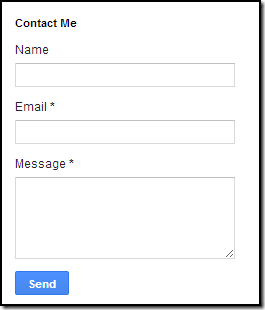
Contact Form By Blogger Tricks Contact Us form is always prove it self important for any publisher. Its an important way to communicate with your Readers in a convenient manner.Not only it will help you to improve your services it could also make your community more reliable as Reader will able to communicate with you live with out any barrier. Previously i wrote a tutorial on How to add Blogger Official Contact Form to Your blog. So most of you are aware of the recent gadget added to blogger widget directory and that is a small contact form with two input fields for name and Email and a text area for writing the message. When any visitor send message to you using this contact form. This message will be send to the email address attached with the blogger. If there are more than 1 Blog admin then message will be send in every email Id related with them. Today Blogger Tricks readers will be the first to learn this trick & you will also learn how to add this form anywhere on your blog. Today i  designed a custom version of this contact form by adding Some new CSS3. We have added the contact Form to a static page. you can add this Custom Form anywhere you want. On static page the Form on sidebar wont display .


Live Preview


Adding a Contact For to Sidebar


Hide Widget From Sidebar


1. Go To Blogger > Template

2. Backup your template

3. Click Edit HTML

4. Search for </head>

5.just above it paste the following statement that will hide the widget on sidebar.

<style>
#ContactForm1{ display:none!important;}   </style>

The above code will hide the Normal Contact Form on a Sidebar only.

Note:- Don't remove the Widget from the Layout of Blogs. This widget will not show in the sidebar of homepage. Instead it will show only in blog Page.


Show Contact Form on Static Page

Since this is widget which can be kept on the right or left sidebar, also in Bottom at footer.  But many bloggers want to keep in separate page.

The contact form that you created has an ID #ContactForm1   , using this ID you can easily locate the HTML code of the normal form in your blog source file. If you want to add our edited contact form so follow These Steps:


1. Go To Blogger Dashboard >> Pages >>

2. Create a New Blank Page (Add text or media)

3. and in HTML Mode Paste the Following Code.

<style>
.contact-form-name, .contact-form-email, .contact-form-email-message, .contact-form-subject, .contact-form-country {
max-width: 300px;
width: 100%;
font-weight:bold;

}

.contact-form-name {
display: inline-block;
background: #FFF;
background-color: #FFF;
color: #A1A1A1;
font-family: Arial,sans-serif;
font-size: 13px;
font-weight:bold;
height: 30px;
margin: 0;
margin-top: 10px;
margin-left: 10px;
padding: 15px 15px 15px 5px;
vertical-align: top;
border: 1px solid #ddd;
box-sizing: border-box; 

}
.contact-form-email {
display: inline-block;
background: #FFF;
background-color: #FFF;
color: #A1A1A1;
font-family: Arial,sans-serif;
font-size: 13px;
font-weight:bold;
height: 30px;
margin: 0;
margin-top: 20px;
margin-left: 10px;
padding: 15px 15px 15px 5px;
vertical-align: top;
border: 1px solid #ddd;
box-sizing: border-box;

} 

.contact-form-subject {
display: inline-block;
background: #FFF;
background-color: #FFF;
color: #A1A1A1;
font-family: Arial,sans-serif;
font-size: 13px;
font-weight:bold;
height: 30px;
margin: 0;
margin-top: 20px;
margin-left: 10px;
padding: 15px 15px 15px 5px;
vertical-align: top;
border: 1px solid #ddd;
box-sizing: border-box;

} 

.contact-form-country {
display: inline-block;
background: #FFF;
background-color: #FFF;
color: #A1A1A1;
font-family: Arial,sans-serif;
font-size: 13px;
font-weight:bold;
height: 30px;
margin: 0;
margin-top: 20px;
margin-left: 10px;
padding: 15px 15px 15px 5px;
vertical-align: top;
border: 1px solid #ddd;
box-sizing: border-box;
}

.contact-form-email:hover, .contact-form-name:hover{
border: 1px solid #bebebe;
box-shadow: 0 1px 2px rgba(5, 95, 255, .1);
padding: 15px 15px 15px 5px;

}

 .contact-form-email-message:hover {
border: 1px solid #bebebe;
box-shadow: 0 1px 2px rgba(5, 95, 255, .1);
padding: 10px;
} 

.contact-form-email-message {
background: #FFF;

background-color: #FFF;
border: 1px solid #ddd;
box-sizing: border-box;
color: #A1A1A1;
display: inline-block;
font-family: arial;
font-size: 12px;
margin: 0;
margin-top: 20px;
margin-left: 10px;
margin-bottom: 10px;
padding: 10px;
vertical-align: top;
max-width: 500px!important;
height: 120px;
border-radius:4px;

} 

.contact-form-button {
cursor:pointer;
height: 30px;
line-height: 30px;
font-weight:bold;
border:none;

} 

.contact-form-button {
display: inline-block;
zoom: 1; /* zoom and *display = ie7 hack for display:inline-block */
*display: inline;
vertical-align: baseline;
margin: 0 10px;
outline: none;
cursor: pointer;
text-align: center;
text-decoration: none;
font: 14px/100% Arial, Helvetica, sans-serif;
padding: .5em 2em .55em;
text-shadow: 0 1px 1px rgba(1,1,1,.3);
-webkit-border-radius: .2em; 
-moz-border-radius: .2em;
border-radius: .2em;
-webkit-box-shadow: 0 1px 2px rgba(1,1,1,.3);
-moz-box-shadow: 0 1px 2px rgba(1,1,1,.3);
box-shadow: 0 1px 2px rgba(1,1,1,.3);

}

.contact-form-button:hover {
text-decoration: none!important;
border: none!important;

}

.contact-form-button:active {
position: relative;
top: 1px;

} 

</style> 

<div class="form">
<form name="contact-form">
<input class='contact-form-name' id='ContactForm1_contact-form-name' name='name' value="Name" size='30' type='text' onblur='if (this.value == &quot;&quot;) {this.value = &quot;Name&quot;;}' onfocus='if (this.value == &quot;Name&quot;) {this.value = &quot;&quot;;}' />
<p></p> 
<input class='contact-form-email' id='ContactForm1_contact-form-email' name='email' value="Email ID"  size='30' type='text' onblur='if (this.value == &quot;&quot;) {this.value = &quot;Email ID&quot;;}' onfocus='if (this.value == &quot;Email ID&quot;) {this.value = &quot;&quot;;}'/>
<p></p>
<input class='contact-form-subject' id='ContactForm1_contact-form-email' name='subject' value="Subject"  size='30' type='text' onblur='if (this.value == &quot;&quot;) {this.value = &quot;Subject&quot;;}' onfocus='if (this.value == &quot;Subject&quot;) {this.value = &quot;&quot;;}'/>
<p></p>
<input class='contact-form-country' id='ContactForm1_contact-form-email' name='Country' value="Country"  size='30' type='text' onblur='if (this.value == &quot;&quot;) {this.value = &quot;Country&quot;;}' onfocus='if (this.value == &quot;Country&quot;) {this.value = &quot;&quot;;}'/>
<p></p>
<textarea class="contact-form-email-message" id="ContactForm1_contact-form-email-message" name="email-message" onblur="if (this.value == &quot;&quot;) {this.value = &quot;Leave Your Message..&quot;;}" onfocus="if (this.value == &quot;Leave Your Message..&quot;) {this.value = &quot;&quot;;}" value="Leave Your Message.."></textarea>
<p></p>
<input class='contact-form-button contact-form-button-submit' type='reset' value='Clear'/>  
<input class="contact-form-button contact-form-button-submit" id="ContactForm1_contact-form-submit" type="button" value="Send" /> <br /> <div style="max-width: 500px; text-align: center; width: 100%;"> <div class="contact-form-error-message" id="ContactForm1_contact-form-error-message"> </div> <div class="contact-form-success-message" id="ContactForm1_contact-form-success-message"> </div> </div> </form> </div>

Write Your Page Title in Title Tab and click on publish button you are done!

Thanks for Reading our Post. Stay tuned by Subscribing our RSS feed or Like our Facebook page and Receive our Daily Updates in your inbox.

Read Article →

1 comments

blogger-contact-form-for-your-blog Blogger Team lunched Official Contact form for blogger users. Contact Form Is Indeed Necessity For a Blog. It Helps Your Reader To Contact You Easily Without Any Problem. Readers Can Ask Question Or Suggest You Something Through Using Contact Form.  We Have Shared An Contact Form Already With You. Which You Can Place On Any Page Of Your Blog By Putting Code. The wait is finally over , yeah Its True ! the wait is over . Blogger finally comes up with his own contact form, Now you no longer have to rely on 3rd party Contact Form solutions.Blogger added a new contact form widget which will be fit into your blog's sidebar You can also add the same contact form on a separate page and customize it , if you want to. Adding this contact form is really easy , just follow below steps.


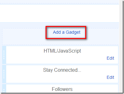
1. Go to Your Blogger Dashboard>> Layout>> and click on add gadget ( Screenshot Below)


Add a gadget

2. Click on More Gadget and click on Plus Button.

More Gadgets


3. Rename Title as you want Click on Save & you are done…!!!!

Contact Form 2

Now you are successfully added Portable Contact Form to your Blogger Sidebar. Thanks for Reading our Post. Subscribe our Rss feed or Like our Facebook page and Receive our Daily Updates in your inbox.

Read Article →

4 comments

This is an important piece of information for those who want to create a sticky  widget on top of the posts in the main page on Blogger blog. There is a easy way to do it. Most Popular blogs have sticky widget that scroll along when visitors move up and down. The effect is usually applied to navigation menu or subscription box, but what kept most people thinking is how they can add the effect to their blog widget. Does that sound like you? This effect will make a widget float downward when visitors scroll down and stay on its original position when visitors scroll up and reach the widget position. The trick is applicable to any widget so far it has a unique ID, regardless of its location, be it top, bottom or sidebar.

sticky widget[6]

Install it on blogger

How to find code in new Updated HTML Template Editor..

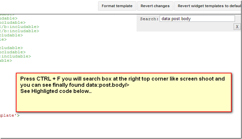
Just in HTML Code Area and Press CTRL+F Your will see Search box on the right top corner in HTML Template Editor. like screenshot Below.

Note:-  Don’t search in Browser Search Box.

How to find code in new Html Editor 

1. Go your Blogger Dashboard>> Template>> Edit HTML>> and press CTRL+F And find the Following Code.

</body>

2. Paste the following code above the </body> tag in your template.
Or if you prefer not to touch the template, you can simply paste it in a HTML/Javascript (in Blogger) or a Text widget (in WordPress). If you choose this route, make sure you position this widget below (after) the widget that you want to make sticky.

<script>
// Sticky widget by Bloggersentral.com

// Tutorial at http://www.bloggersentral.com/2013/04/how-to-make-any-widget-sticky.html

// Free to use or share, but please keep this notice intact.

//<![CDATA[
bs_makeSticky("YOUR_WIDGET_ID"); // enter your widget ID here
function bs_makeSticky(elem) {     var bs_sticky = document.getElementById(elem);     var scrollee = document.createElement("div");     bs_sticky.parentNode.insertBefore(scrollee, bs_sticky);     var width = bs_sticky.offsetWidth;     var iniClass = bs_sticky.className + ' bs_sticky';     window.addEventListener('scroll', bs_sticking, false);     function bs_sticking() {         var rect = scrollee.getBoundingClientRect();         if (rect.top < 0) {             bs_sticky.className = iniClass + ' bs_sticking';             bs_sticky.style.width = width + "px";         } else {             bs_sticky.className = iniClass;         }     }

}

//]]>
</script> 
<style>
.bs_sticking {background:#f2f2f2 !important; position:fixed; top:0; z-index:9999; box-shadow:0px 10px 4px -5px rgba(0,0,0,0.3);}
</style>

3. Get the ID of the widget or element you want to make sticky and enter it in line 6 (replacing "YOUR_WIDGET_ID"). For example let's say the widget ID is HTML9, then code line 6 would become:
bs_makeSticky("HTML9");

4. Preview before saving.

If you have still any problem please feel free to post queries below in comment box. Thanks for reading our post. Blessing Pals….

Read Article →

0 comments

1_google.plus_ You might be familiar with the latest commenting system has introduced that integrates Google plus Comments itself with blogger blogs. This commenting system has some nice features and its even look more better that default blogger commenting system and it supports threaded comments. but more that hundred people still have problems implementing it on custom templates. in this tutorial we going to learn how enable Google plus comments and how to apply on custom blogger template and use this new improved commenting system on blogger blog.

The good thing is that these commenting system supports threaded comments. i know we all like to see threaded comments installed on our blogger blogs, am i right?


Before telling you how to activate threaded comments on Google plus comments on blogger blog, i am going to tell you how to activate Google plus comments on blogger blog. you can enable in four easy simple steps. Before enabling your blog must have linked to Google plus account.


1. Go to your Blogger Dashboard>> and then click on Google+ button on the left side menu.


2. click on the get stared button the top left side to connect your account.


3. complete the simple steps with Google instructions to connect your blog to Google Account.


4. One you have done linked your blog with your Google plus account. your will see an option Use Google Plus comments on this blog. you can enable by checking this button.


This does not work for custom templates at the time of publishing this post, that is why we need to apply some codes to make it works.


How to enable Google plus Comments on custom blogger template

You can enable Google plus comments on custom blogger template by taking two easy steps.


1. Go to your Blogger Dashboard>> Template>> Edit HTML>> and then just click on Revert Widget Templates To Default Button at the top right corner of Template HTML Editor. Also See Screen Shoot Below.

Note:- Before Editing Your Template you must always remember to backup your template in-case of any mistake.

Widget templates to default


I am sure this two simple steps definitely solve the problem and you will see the Google Plus Threaded Commenting system on the comments area, though most times you may lost your customization on the reverted section which may include something like, Auto Read More. But if you can afford to loose your customizations, you can use the second Method For solve that problem.


2. Go to Template HTML Editor and Press CTRL+F and search for the Following code. like Below.

<b:if cond='data:post.showThreadedComments'>

<b:include data='post' name='threaded_comments'/>

<b:else/>

<b:include data='post' name='comments'/>

</b:if>


<b:if cond='data:post.showThreadedComments'> <b:include data='post' name='threaded_comments'/> <b:else/> <b:include data='post' name='comments'/> </b:if>

and Replace these two code section  with following code & you are done…!!! exact code look like this you just need to replace blue code.

You will find code like this

Replace Blue Code with the below code.

<b:include data='post' name='comment_picker'/>

If this Tutorial is a little bit useful for your by commenting so then share it with your friends and your public profile. if still have a problem feel free to post your queries in the comments box below. Thanks for reading our post.

Read Article →

5 comments

google plus comments Blogger Team are recently introduced Google plus comments system that is compatible with the default blogger template as well as with custom blogger template either free or paid. lots of people gone ahead and implemented it on blogger blog. This is a biggest improvement in blogger over the last 1 year. Especially for bloggers who can track the conversation more easily. At the same place, readers can contribute right from google plus, without needing to open the blog. But here is a some disadvantage of using google plus comments system. These might manifest themselves later on, if not immediately.


Some disadvantage of enabling google plus comments system

One of the major problem with Google + commenting system is that, people not having a Google Plus profile or account will not be able to post a comment. If they do so, they will be prompted to sign up for a Google Plus account. In a rare case people would sign up, rest would pass by. Finally you lose a comment. Recent Comments widget that basically pumps out feeds from blogger comments won't be working on Google + commenting system. Custom blogger templates will have to be edited manually for this widget to work. Default blogger templates will get the widget by default after enabling Google + Commenting from the blogger dashboard. Currently this feature has been rolled out for blogger platform only. Rest all the platforms like Word press, Tumbler has keen kept deprived off for the time being. If you change your blog URL to a custom domain, you will lose all your Google + comments.

A slightest change in the url will make you lose all the comments you have received after you integrated this feature with your blog. Another big disadvantage is the increase in Page Load Speed. It takes some time before all the data is fetched from Google. Usually, this isn't noticeable, but try loading your blog on a slow dial-up connection, and you will see those comments appear much later.


All in all, it's a pretty good Improvement, but Google really needs to spend some more time with it. If you have problems, or have suggestions, please feel free to comment in the section below. Thanks for reading our posts. Cheers happy blogging.

Read Article →